Australian Open - Federation Square Pop-Up
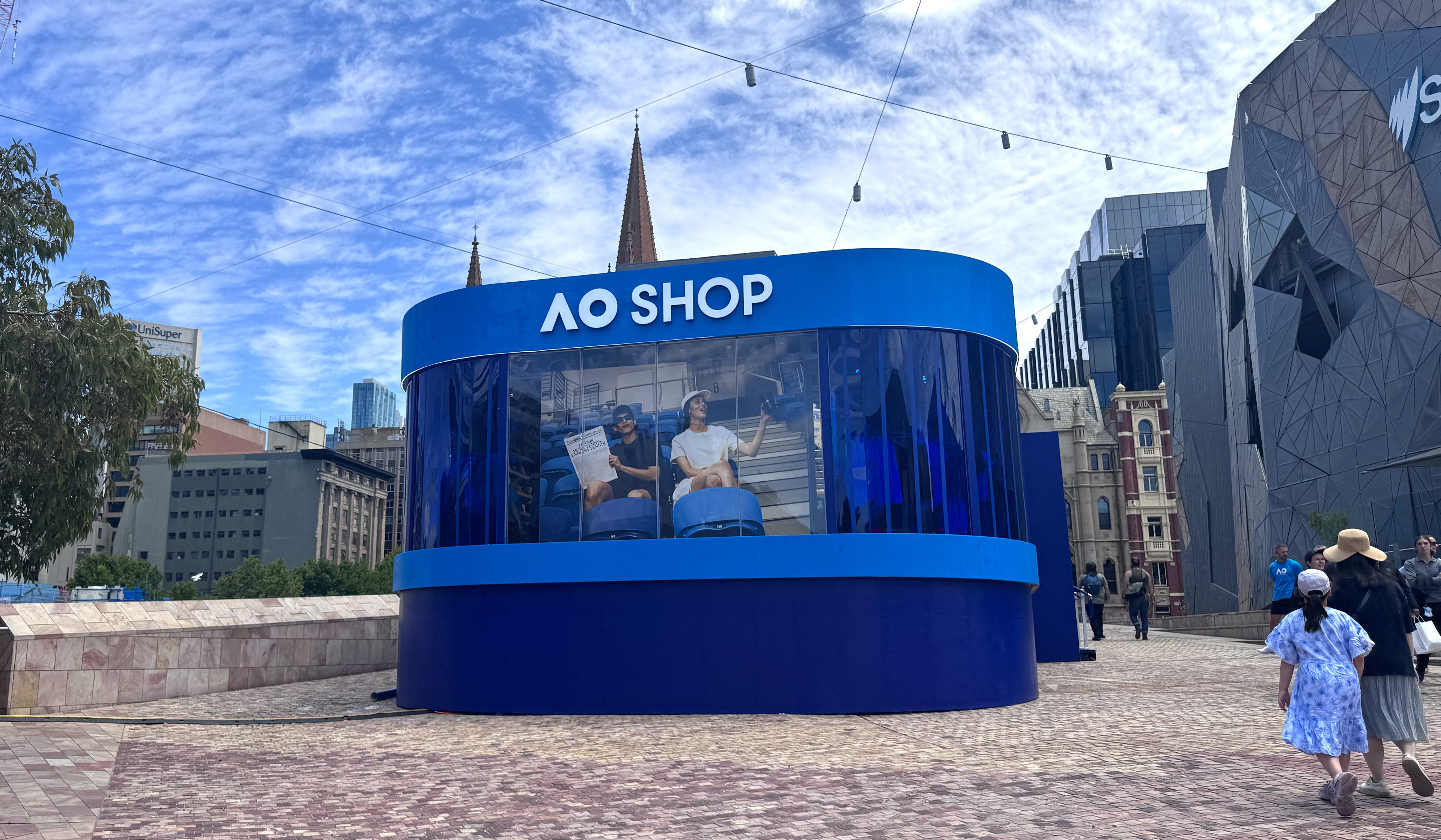
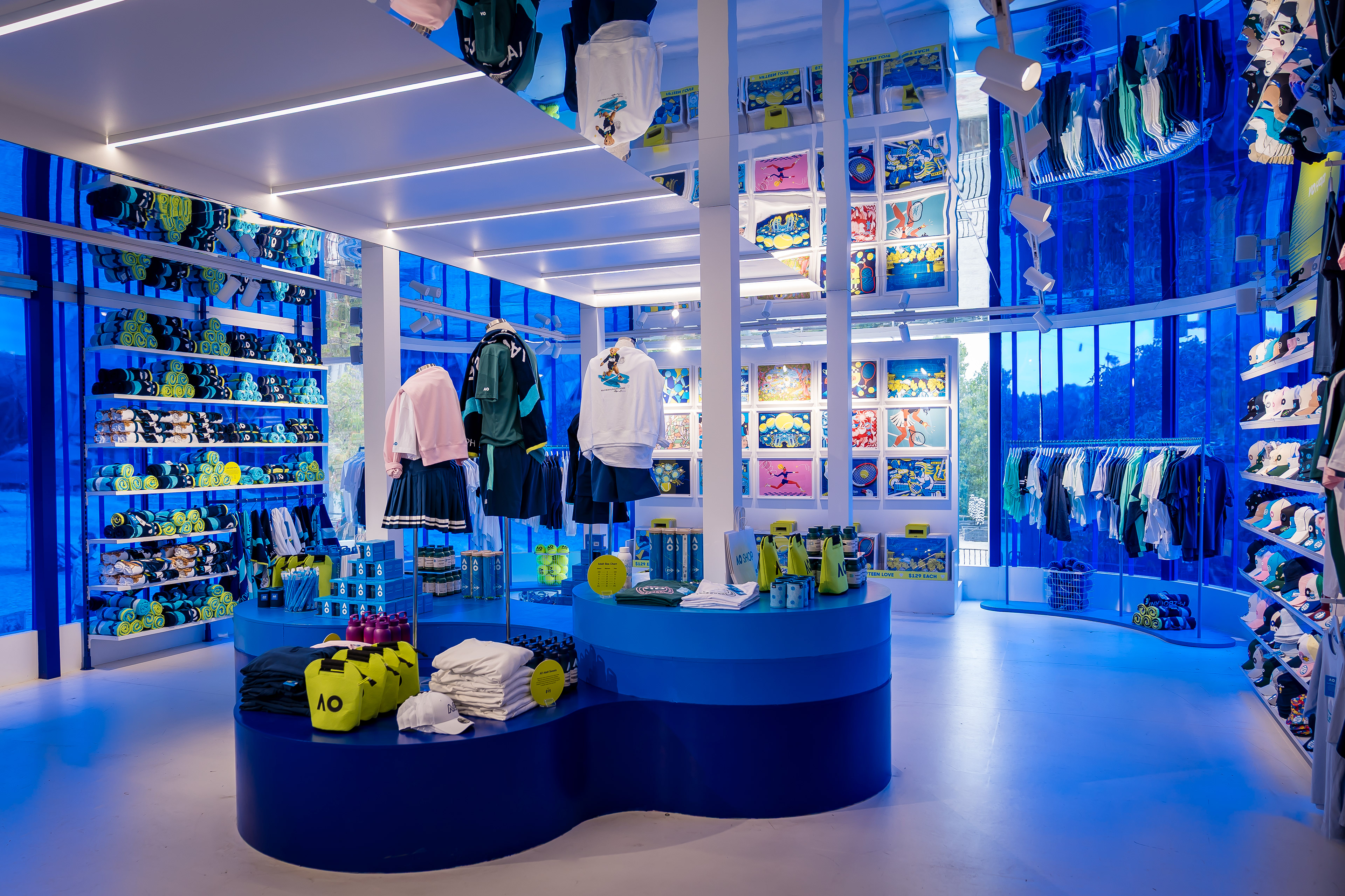
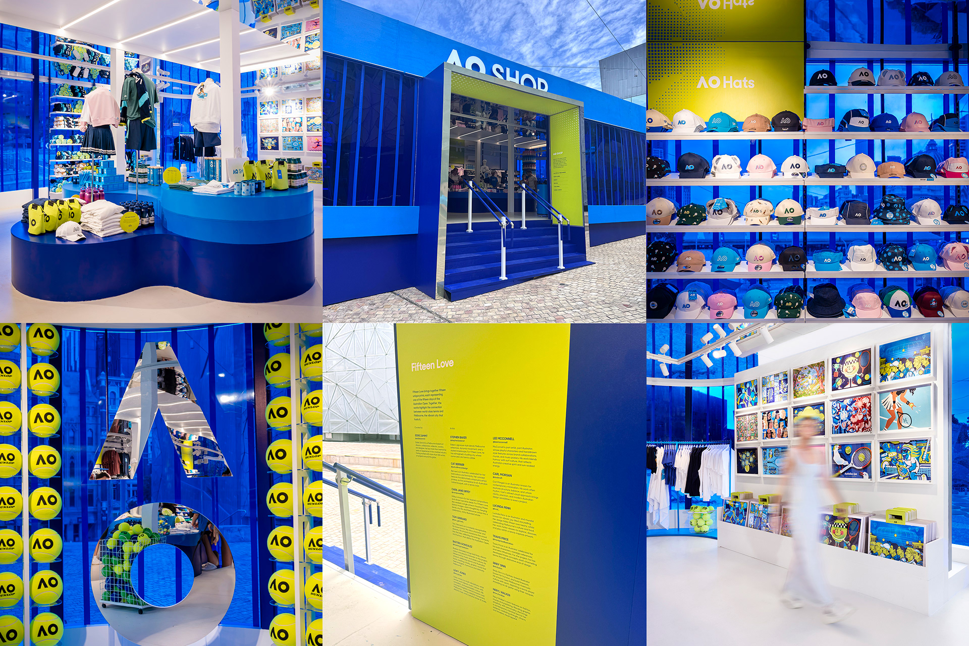
Positioned in the heart of Melbourne, the Australian Open Federation Square pop-up marked a major brand moment — the first retail experience outside the official AO precinct. Leading the end-to-end environmental design, I created a bold, cohesive visual world across all customer touchpoints — from large-scale hero graphics and gallery walls to POS, talking cards and in-store storytelling moments. A powerful example of how considered design can amplify brand presence, drive engagement and create a truly immersive retail experience.
ENVIRONMENTAL DESIGN / COPYWRITING / FINISHED ARTWORK
You may also like
David Jones / The Art of Living
2019
To celebrate the launch of David Jones’ AW19 Campaign 'The Art of Living', MONA played host to an immersive two-day media launch. The collateral was designed in collaboration with Melbourne artist, ‘Spenceroni’, to create a strong injection of colourful graphics that featured throughout all physical and digital touch points.
DESIGN / FINISHED ARTWORK / PRINT MANAGEMENT
Koko Black / Xmas Packaging
2021
The 2021 Koko Black Christmas collection was conceived together with Melbourne design agency, Studio Round. Over 100 products were executed in-house, from packaging engineering to finished artwork, to deliver a modern collection of premium gifting.
DESIGN MANAGEMENT / FINISHED ARTWORK / PRODUCTION MANAGEMENT
Saltram Wines / Brand Relaunch
2000
Celebrating the tradition and heritage of the Barossa Valley since 1859.
LABEL DESIGN / BROCHURE DESIGN / DESIGN MANAGEMENT
Koko Black - Critters Packaging
2025
Celebrating Australia through a playful, design-led lens, the Koko Black Critters collection was created to capture the charm of our native wildlife and landscapes in a series of collectable pencil tins.
Building on the existing Critters family, the concept evolved into a distinctly Australian gifting proposition — blending storytelling, illustration and product design to reflect the brand’s heritage and connection to local ingredients. Each tin represents an iconic Australian setting — beach, outback and billabong — brought to life through rich, layered illustrations and vibrant colour palettes. Together, they form a cohesive series designed to be collected, gifted and repurposed by kids long after the chocolate is gone.
CREATIVE DIRECTION / PACKAGING DESIGN / FINISHED ARTWORK
Country Road / Kids Spring Campaign
2015
Art direction and design for the 2015 Kids Spring campaign.
The campaign was executed across all physical and digital
touch points, including a 16 page fold out catalogue.
ART DIRECTION / DESIGN MANAGEMENT
David Jones / Elizabeth St
2018
To celebrate the launch of David Jones' Designer Shoe Floor in the newly refurbished Elizabeth Street store, an exclusive media invitation was designed to echo the iconic arch windows of this heritage listed building.
DESIGN / FINISHED ARTWORK / PRODUCTION MANAGEMENT
Fashion Revolution
2018
Country Road / Christmas Packaging
2016
A modern Australian Christmas bursting with sunshine - this was the inspiration behind Country Road’s 2016 Christmas. The creative direction and design management of all Christmas packaging was created entirely in-house by the Country Road design team.
CREATIVE STRATEGY / PACKAGING DESIGN / DESIGN MANAGEMENT
T2 Tea / Festive Campaign
2021
A celebration of gratitude and happiness was the theme for T2’s 2021 festive season. The ideation and entire rollout of the campaign was designed in-house to showcase a connected, playful and celebratory campaign that would create a ripple effect of positive emotion throughout every customer touchpoint.
CREATIVE DIRECTION / DESIGN MANAGEMENT
Smiggle / Product Design
2009
The ultimate creators of colourful, fun, fashion-forward stationery.
In 2009 I worked within the Smiggle Design Lab to create an
abundance of original, fun and colourful products and stationery.
PRODUCT DESIGN / FINISHED ARTWORK